
Content. Conversations. Copy.
And AI systems powering them.
Cozmo
REDESIGNING FOR ENGAGEMENT

Project Details
Company
Anki Robotics, 2017-2018
Challenge
Post-launch, Cozmo owners loved their robot pal. However, there was room to improve on engagement, or the amount of time users spent with Cozmo. In the toy market, higher engagement is correlated with positive reviews, word of mouth, and repeat purchases.
Solution
Redesign the experience, providing opportunities for owners to nurture Cozmo like a pet.
My Role
As a Senior Designer, I led content efforts for the redesign, as well as other UX and strategy initiatives. I'll focus on content and UX writing in this case study.
Contents
Exploratory user research, competitive analysis
Content goals, style guide creation
UX writing for redesigned onboarding and app experience
20% increase in engagement, #1 premium toy on Amazon in 2018
Research
Context
In the original app, the experience was largely transactional. Owners completed tasks, earned currency, and spent that currency on new features.
The transactional nature of the experience was a mismatch with how users naturally interacted with the robot, which was more like a pet.
Original App

The original app was a transactional experience, where owners earned and spent currency.
USER INSIGHTS
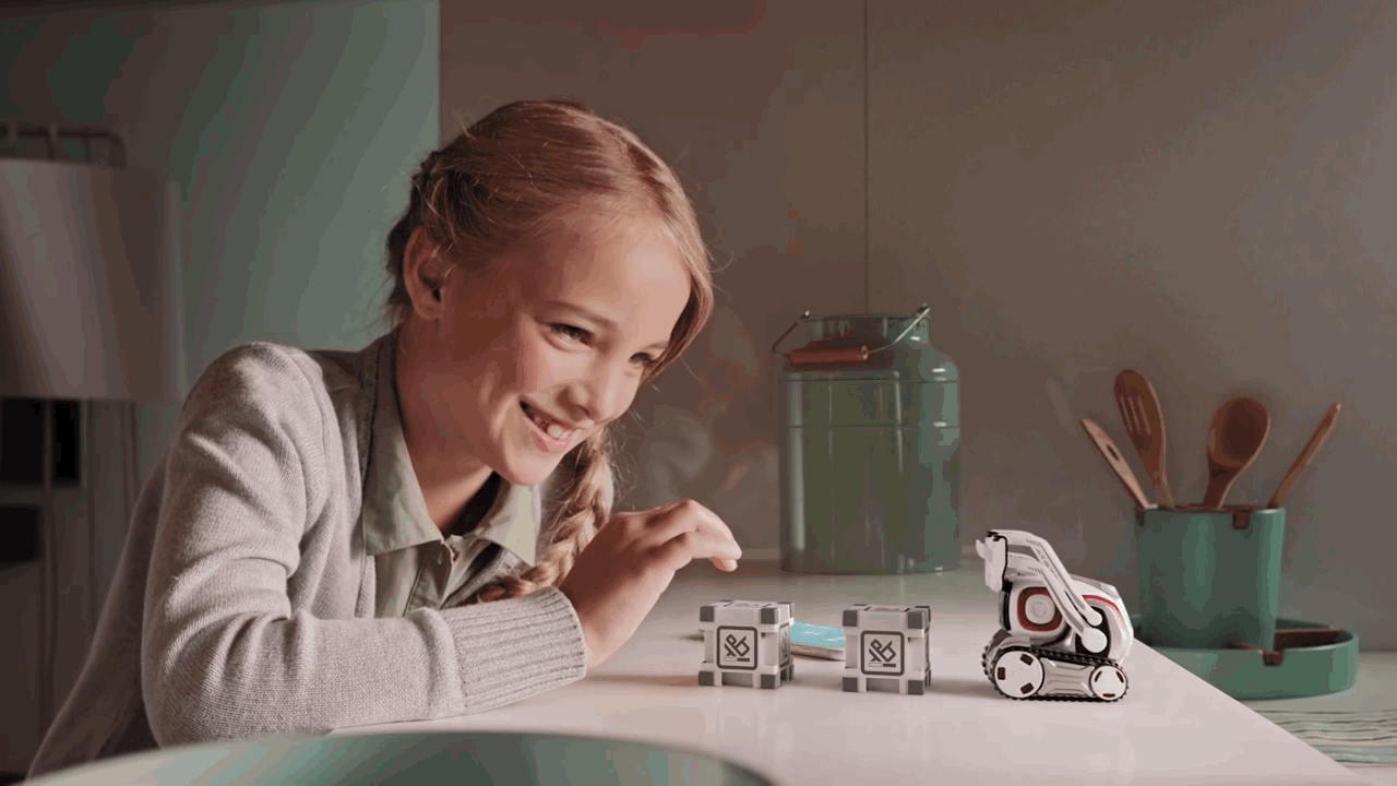
Kids nurture naturally
When kids met Cozmo, they believed he was alive. They reacted to his emotions. They were careful when they picked him up. Sometimes they let him win a game, just so he could be happy about it.

Playtests helped us learn how kids interacted with Cozmo. (Image used in promotional materials with participant permission.)
In addition to interviewing users, we conducted competitive analysis on entertainment and educational products that had a nurturing component.
With this research, we went to work making the Cozmo experience more like a pet and less like a currency-based game.
Style Guide
Content Goals
1. Simplify wherever possible.
Part of the redesign involved adding a "needs system", where the owner would feed, tune up, and play with Cozmo daily. The app was already a complex experience. I looked for places to clarify language, simplify information architecture, remove concepts, and make the new onboarding as intuitive as possible.
2. Write for all ages.
We discovered that there was a significant teen and adult audience for Cozmo. Consequently, we strived to "age up" the product both through copy and visuals, while still keeping it accessible for early readers.

Teen students and adults comprised a significant portion of Cozmo owners.
3. Create a shared language.
There was significant historical knowledge that teams knew but wasn't written down anywhere. For example: What do Cozmo's light colors mean? What do we call the flashing patterns of his cubes? What do we call it when Cozmo first comes to life? I sought to collate this knowledge into a shared document.
Style Guide
I took these content goals and translated them into a style guide, which was created in Google slides where the team could give iterative feedback. While the original is lost to time, below is a recreated document based on the same principles.
UX Writing
UX WRITING
Creating consistency and clarity
Details matter. A lot of the work I did was go screen by screen and ensure each was as usable as possible. To help the team visualize the effort, I put each screen on poster boards and marked their status as they were completed.

Poster boards displayed near our desks helped visualize progress toward the app rewrite/redesign.
UX WRITING
App redesign
Below are examples of UX writing I implemented for the app redesign.

Initial Screen

Onboarding Screen: Create Great Space

Onboarding Screen: Connect to Cubes

Onboarding Screen: Enter Cozmo's Password

Onboarding Screen: Goals/Needs
Discover Screen

Play Screen

Results
Results
Impact
The redesign of the UX and content experience resulted in a 20% increase in overall engagement, meaning users spent 20% more time with Cozmo.
Additionally, Cozmo was the #1-selling premium toy of 2018 with 4.5+ stars on Amazon.

Takeaways
-
Something that worked well: The needs system (and accompanying content redesign) evoked a nurturing relationship with Cozmo and provided a reason to come back each day.
-
Something I would have approached differently: Make interactions the focus of the app, and Cozmo's needs secondary. While needs were successful in creating a reason to return, users were most interested in accessing the cool things they could do with Cozmo. In a later iteration of the app, these interactions were moved to the home screen for easy access.


